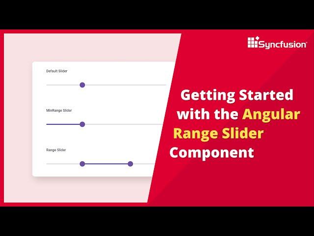
Getting Started with the Angular Range Slider Component
Learn how to add and configure the Syncfusion Angular Range Slider component in an Angular application using Visual Studio Code. The Angular Range Slider is an HTML5 input control that is used to select a value or range of values. You can select a value by moving a thumb along a bar. The control has major and minor ticks, thumbs, and tooltips that can be fully customized.
In this video, you will also learn how to work with a few of the Range Slider’s basic features, like types, ticks, tooltips, formats, and limits, and how to customize the Range Slider using CSS classes.
The Angular Range Slider is commonly used in scenarios where users need to set or select a range of values, such as a price range or a date range. The Range Slider's appearance, behavior, and functionality can be customized to match the requirements of the application. This includes customizing the slider's appearance, orientation, step interval, and more. It can also be aligned horizontally or vertically.
The Range Slider component provides built-in tooltip support, which displays the selected range values as users interact with the slider. Tooltips help provide real-time feedback to users. You can add ticks and labels to the Range Slider to mark specific values or intervals. This is useful for showing predefined values or categories along the slider.
The Range Slider offers a set of events that allows you to respond to user interactions, such as when the value changes or when the user releases a handle. It also has a comprehensive API for programmatic control and manipulation.
Explore our tutorial videos: https://www.syncfusion.com/tutorial-videos
Example project: https://github.com/SyncfusionExamples/getting-started-with-the-angular-range-slider-component
TRIAL LICENSE KEY
-----------------
If you need a trial license key, start your Angular trial from https://www.syncfusion.com/downloads/angular/confirm under your Syncfusion account. Then, you can obtain your trial license key from the Downloads page.
Check your eligibility for a free license for all Essential Studio products on our Community License page.
https://www.syncfusion.com/products/communitylicense
BOOKMARK DETAILS
------------------------
[00:00] Angular Range Slider - Introduction
[01:03] Create an Angular app
[03:04] Add the Angular Range Slider component
[04:10] Types
[04:56] Tooltips
[06:05] Slider buttons
[06:31] Ticks
[07:22] Formatting
[07:47] Limits
[08:50] CSS customization
ANGULAR RANGE SLIDER
----------------------------
Product overview: https://www.syncfusion.com/angular-components/angular-slider
Examples: https://ej2.syncfusion.com/angular/demos/#/material3/range-slider/default
Documentation: https://ej2.syncfusion.com/angular/documentation/range-slider/getting-started
Download free trial: https://www.syncfusion.com/downloads/angular
npmjs package: https://www.npmjs.com/package/@syncfusion/ej2-angular-inputs
SUBSCRIBE
---------
Syncfusion on YouTube: https://www.youtube.com/user/syncfusioninc
Sign up to receive email updates: https://www.syncfusion.com/account/email-preference
SOCIAL COMMUNITIES
-------------------
Facebook: https://www.facebook.com/Syncfusion/
X: https://x.com/Syncfusion
LinkedIn: https://www.linkedin.com/company/syncfusion/
Instagram: https://www.instagram.com/syncfusionofficial/
#angular #slider #range
Тэги:
#Syncfusion #Develop #Software #Technology #Developer #Components #Angular_Range_Slider #range_slider #slider #angular_slider #HTML5_input_form_control_in_angular #range_slider_component #slider_component #angular_slider_component #slider_component_in_angular #HTML5_input_form_control #input_form_control_in_angular #angular_input_form_control #slider_in_angular #range_slider_component_in_angular #slider_customization #material_range_sliderКомментарии:
Getting Started with the Angular Range Slider Component
Syncfusion, Inc
Шашик и Огр максим напали на голубку
Прикольный Канал
МОРДЕН 2024 - НОВЫЕ ТРЕБОВАНИЯ САМОЙ ЭФФЕКТИВНОЙ ПРОГРАММЫ ИММИГРАЦИИ В КАНАДУ
PALLEONN IMMIGRATION - ИММИГРАЦИЯ В КАНАДУ
Ibis Ripmo V3 Review! (Better In Every Way)
Awesome MTB (Mo and Hannah)
amazing effect #viral
#cartoon video


