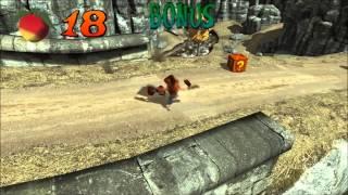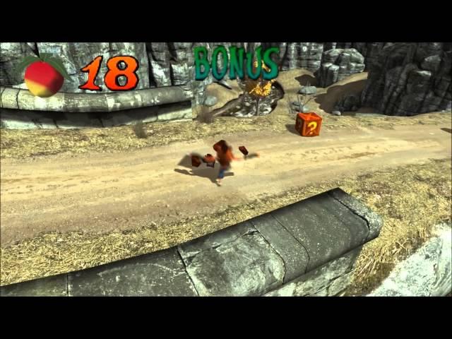
Crash Bandicoot - Castle level on UDK by Marcin Matuszczyk
Комментарии:

Please please please continue this project, I love it
Ответить
If this would be completed, I would rather pay for this then for stupid EA like games.
Ответить
This is muchbetter than actual Crash Bandicoot games. You have been able to keep it real and modern at the same time. Thank you for bring me back such a nice memories.
Ответить
This shit looks horrible
Ответить
the level design and lighting is awesome. Crash himself i would work a bit more on such as the running animation looks like he's doing a forward moonwalk lol but if the goal was the level design than good job looks great
Ответить
até que os cenarios ficaram legais mas o crash ta parecendo um fantoche ta horrivel
Ответить
E un offesa a crash bandicoot questo video 😂
Ответить
Ok come on is freaking funny!
Ответить
You have just to work on the camera because is perfect.
Ответить
чётко без лагов
Ответить
his hand's too big than his head
Ответить
Continúe plis.
Ответить
i like it so much , please keep doing!
Ответить
download demo?
Ответить
You used the wrong crash model, the walking is a bit off otherwise great attempt.
Ответить
Se ve bien feo jajajaja todo tronco el crash jajaja me quedó con el de play 1
Ответить
this crash
from what do you play this game pc or wii u or ps4?

Jesteś Polakiem?Miło spotkać fana Bandicoot'a :D Kurde jak ja tęsknię za tymi grami, może w końcu jakiś producent by coś wyprodukował w 2016...
Ответить
I'm making a similar game but in unity 5. And I need the script that crash lose one life and return to the last checkpoint. Can you pass me this? please and thanks
Ответить
lololol
Ответить
camera suck, best original one...
Ответить
Level design is coming along great, but it's too realistic and gray ;x Make it more colorful and cheery and it will look perfect xD
Ответить
Excellent, please make a tutorial!
Do you have a blog?

Nice!!!!!!!!!!!!!!!!!! :D This is a awesome fan made level!!!!!!!! :D
Ответить
SOOOOOOOOOO NICE! I love it!
Ответить
Wow that was cool !!
Ответить
veriii coool
Ответить
Wtf is this
Ответить
This is so beautiful.
Ответить
Super creative level design
Ответить
why crash its a look a hamster xD
Ответить
can you show me, how to make something like that , i want also do something like that!
Ответить
Kingdom valley from sonic the hedgehog
Ответить
esta rre duro ese crash xD!
Ответить
cóż lepszy Crash na UDK niż mapa do UT... pozatym dobra robota!
Ответить
he's the terminator , you can notice it in his walk
Ответить
AWESOME!
Crash himself looks a bit, uh, uneasy, but everything else is excellent!!!!!!!!!!!!!!!

The level design looks like it could be further explored. I looks like it belongs to an MMO game
Ответить
This is really creative. Nice job!
Ответить
cancer :v
Ответить
asco 1000
Ответить
Gameplay was awesome... better than CB WoC
Ответить
Good work! I think you put a lot of effort in this
Ответить
Been a crash fan for decades this desing is simply amazing! Those breathtaking landscape and delightful lore elements you made me feel the immersive experience I feel with the first games and their beautiful aesthetics.
My only note would be that the level itself, platforms/enemies felt really bland, like the wrath of Cortex levels, there seemed to be big gaps in the enemies attack and between obstacles/enemies and not the sinergy of crash warped levels. However this may not be the goal, still there's so much potential!
I'd love to play one of your levels someday.

this look like shit hahahahaha! nasty designer
Ответить