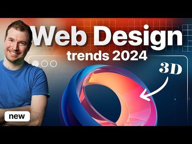
10 New Web Design Trends that Emerged in 2024
Комментарии:

2024 design: the blunder years
Ответить
Where did you find the websites?
Ответить
Except, maybe, the bruralism example... what unusable eye sores.
Ответить
Terrible job with the pixel grid my dude. Please re-upload it again so we can see the actual designs.
Ответить
This vedio's designs are easier to do in CSS than it is on Figma! A word of advice to follow!!!
Ответить
Bro add the links to these websites please, good work!
Ответить
mate that grid pverlay or whatever tf it is, is so annoying to watch
Ответить
90% of this is brand identity
Ответить
instead of moving into more modern design approach, the industry moving towards more classic and old styled trend! lol. ugh.
Ответить
what's with the CRT filter?
Ответить
Me watching the video:- I can design these
Me in figma:- WTF😂😂😂

Fantastic vid and highlights and examples 🎉
Ответить
Great stuff as per usual. Question: As a designer are you 'stuck' to a particular set of 'trends' you just vibe with? I find myself still preferring things simple, not necessarily minimal but towards that end. And I guess I struggle with the other styles like maximalism. I even struggle with using 100% of the width of the page sometimes :)...
Do you think it's better for designers to branch out or perhaps to specialise and hone their own styles?


