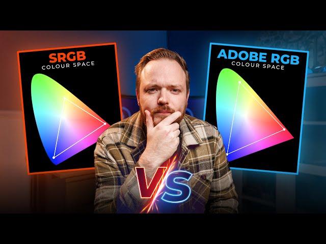
Should You Use SRGB Or Adobe RGB | What’s The Difference?
Комментарии:

A lot of things need to be considered. If your purpose for printed media, these RGB not so usefull, the printed result will be different. If the result would be displayed at outdoor screen, the color will be affected by the sun intensity. But this rgb would be usefull for indoor display, inside a room with stabil lighting.
Ответить
Great video. Im starting my jorney throught color space, n u helped me a lot. God bless you
Ответить
Thanks ❤
Ответить
He said: 1. "the photograph taken in AdobeRGB mode can easily be converted into sRGB", and 2. "sRGB photographs can't easily be converted into AdobeRGB". Something is wrong there. Here is my version: 1. "the photograph taken in AdobeRGB mode can be converted into sRGB, however a change of colors will occur for the colors that are outside of the gamut of sRGB", 2. "sRGB photographs CAN easily be converted into AdobeRGB without loss of color". I am not sure what he was thinking, but maybe he was thinking about a roundtrip conversion from AdobeRGB, to sRGB, and back to AdobeRGB. The final result in AdobeRGB would then suffer from the loss of color that occurred at the first conversion of the roundtrip.
Ответить
Thanks for this very helpful overview. Appreciated seeing the color spaces and hearing the explanation. Really appreciated hearing the history!
Ответить
Actually confusing more than elucidating. Would be better to show the color space range diagrams And what about ProRGB.
Ответить
Adobe RGB (1998) for printing. sRGB for social media. ProPhoto RGB is useless to me. No printer will ask for sRGB or ProPhoto RGB profiles.
Ответить
Well done!
Ответить
You mentioned Prophoto RGB in the intro but did not compare it to the others. It would also be helpful to understand what is compromised when converting from a high-quality RAW or DNG file to one of these colour spaces
Ответить
What about P3?
Ответить
That was very useful, thanks.
Ответить
This was a complicated subject for me. Thanks for explaining it so easily!
Ответить
Nicely done! I love the use of vintage graphics and footage. Very creative, very polished. Also, more importantly: This is a wonderful comparison of the two color spaces. Thanks!
Ответить
Thanks for a simple and very clear explanation of color spaces!
Ответить
I did CYMK color separations for offset printing starting in the Photomechanical Lab at National Geographic in 1974 using contact screens and litho film and beta testing the first DuPont SWOP CYMK Cromalin Pre-press proofing system. I then became customer service production manager at a large high-quality magazine printer in the 80s and in the 90s through 2010 converted the analog workflow of USIA’s Manila Publishing Center to digital starting on Macs 1987 and used the first versions Photoshop in the early 90s and the MacOS before ICC profile based color management was added so I know the history and technical reasons.
sRGB was the default color space for CRT monitors used on MS-DOS and Windows computers. It can display some saturated reds, blues and purples CYMK ink can’t match. It had a gamma of 2.2 and white point of 6800° K Apple Color monitors had Apple RGB gamut and 1.8 gamma and if memory serves the same white point of 6800°K. The upshot of that we Graphic Arts pros edited on Mac but when viewed by customers the difference in gamma made the look different. Our CYMK printed results didn’t match what was seen on either color space
CIE*xyz color management was added to the MacOS when it was revised in 1995. Microsoft didn’t add it to Windows until Windows 98 and Abobe added profile based color management around V4 in 1998 when it also created AbobeRGB 1998 from an existing HDTV standard and SWOP CYMK.
What makes Adobe RGB different that sRGB is it IS NOT AS SATURATED in reds, blues and purples. It was tailored not to exceed the reds, blues and purples SWOP CMYK can print. So in those colors the Adobe RGB gamut is actually smaller (less saturated) than sRGB! Why is that a good thing? Because a calibrated Adobe RGB gamut monitor WILL match the results of a Web Offset Press. SWOP = Standard for Web Offset Printing and Judd&Deweiler in Washington, DC where I worked 1977 - 80 as production manager was on the Printing Industry of America committee which created it back in the mid-1970s to keep color separation houses from ‘cheating’ on press proofs using not standard inks.
A classic example is a Revlon lipstick add. It is impossible to match the pigments in the actual product with CYMK so the color separation house would mix in PMS Red colors with the Magenta ink so ad agency and client would approve. We would get the CYMK films for the ad, print it, not match the doctored proof or product, Revlon > ad agency > magazine would demand a free re-run.
Once SWOP was the standard we would just flat out reject any non SWOP proofs for ads. After a few rejections and some education about color science — I taught the class to magazine art / production managers in the late 70s — everyone started using SWOP. The ad did match the actual color of the product unless a 5th PMS color was used on top of the CYMK. But for lipstick the product always looked better than the add.
In the case of clothing catalogs the same SWOP CYMK gamut limit applied and the way it worked in the industry is fabric dyes were also limited to the CYMK for clothes sold in the Sears catalog etc. so the would match printed image.
The entire point of a calibrated workflow is to alter the gamut of the computer monitor to match CYMK printed output so printed results can be accurately seen on screen… You need to make the monitor gamut match press profile and that is done electronically via ‘soft proofing’ mode:
monitor native gamut (uncalibrated) > monitor calibration profile > CYMK ink paper profile > monitor display
In soft proof mode if you try to push a color past the CYMK / paper color space that area “clips” and grays out on screen like the highlight clipping warning.
How big a working (editing space) do you need? Some of the larger ones were designed for astrophotography for cameras which do not have IR and UV filters and are too big for general human vision range editing. Adobe RGB is adequate for general photography for screen display and most printers. If using a wide gamut > Abobe RBG printer compare the working space with printer profile in System > Utilities > ColorSyncUtility App

The reality of the different color spaces is not the ideal but the practical. It’s not how to make the perfect image but rather how to universally display it across a plethora of lousy computer displays. You can dream about your giant image being displayed at a gallery wall or such location but more eyes will see it on their lousy computer displays.
Ответить
How Hasselblad HNCS relates to those color spaces?
Ответить
What is the "ideal" color space for editing a photo straight out of the camera, shot in JPEG and displayed on a 4K monitor?
Will editing a straight out of the camera JPEG photo, edited using Adobe RGB, saved and displayed on the Web be automatically displayed there only in SRGB?


