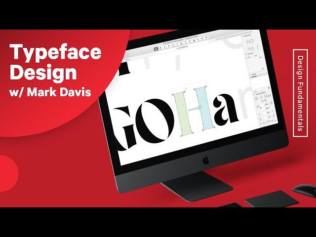
Typeface Design & Font Making Process w/Mark Davis
Комментарии:

The passion this guy has for font is inspiring. I really had know idea how deep it goes with the creation of something I just casually browse past each day.
Ответить
I think he knows his subject, but is unable to communicate it well. The audience, in general is not that technically aligned with type, as one expects designers to be. It was a wonderful session that made me feel like my approach to type should be in the details and how to communicate better using it. Thank you Futur team for this.
Ответить
Great!! Thank you!!
Ответить
This was so informative, I know nothing about making fonts but this interview was filled with insights
Ответить
Very useful ... specifically when using that tools and references..
Ответить
Great interview.
Ответить
"The Quick Brown Fox Jumped Over The Lazy Dog"
Letter S: 🤡

i love this video
Ответить
Found this today and it’s excellent. I’ll watch repeatedly when I am working.
Ответить
what is this font organizer mark uses?
Ответить
guest: "let's talk about type design" - host: "NO–let's talk about Futura!" —kidding aside, thank you for this interview; what excellent information by such a talented individual.
Ответить
Amazing!
Ответить
Isn’t it illegal to ‘cut’ new versions of existing fonts? Doesn’t the original foundry own the intellectual property? No sure interés, just want to know .. thank you!
Ответить
fuck your life story, get to the point
Ответить
I wonder what Chris was thinking when Mark said the client talked him down from $5k. 🤣🤣 Only true Futur fans will understand what I mean.
Ответить
I like how Chris was humbled enough to say I need help! alhamdulila
Ответить
I would love that series on typeface history and the stories behind different ones!
Ответить
oops! anh này đẹp trai tek
Ответить
Why does the Futur ALWAYS have the exact video I need, every damn time.
Ответить
Thank you. This is great!
Ответить
Serifs are important.
Ответить
This is GOLD. Thanks for sharing!
Ответить
I'm working on a Century-like font, trying to clean up the URW++ version of it, and develop it into more than just the two weights Century-like fonts tend to have, and with optical sizing (and quality triplet/quadruplet kerning). The URW++ outlines aren't consistent enough to interpolate right away, but I'll get there eventually, and then I can build it into an excellent MM variable font that is enough like Century to be used with the supreme court, but better in every important way.
Ответить
Great video, thank you!
Ответить
Man, I cannot find the full family for Luz Sans.. this is sad :(
Ответить
Really great! Would really love mor content from Mark Davis. Really interesting to see the old specimens
Ответить
Not every designer hates trump/ america. Some of us want america to be strong.
Ответить
please look into using discord, way better quality with everything and more advanced
Ответить
This is GOLD, Thank you :)
Ответить
i would watch that video
make that a video

Chris and Mark, I love everything about this stream. Cannot thank you enough.
Ответить
I want the type history video <3
Ответить
I've watched this three times now. I'd love more type design videos!!
Ответить
My type of geek
Ответить
Excellent as always
Ответить
I thoroughly enjoyed this episode in it's entirety. I'd definitely love to see more of a demo of specific characters too. We got a good look at the extremes of straights vs curves with the H and I, but I'd love to see the process with a lower case 'e' for instance, or the angled V and A.
To see the process of how to think about stress angles, and how that might change during the process.
Thanks for the content.

Snowden of fonts. Just kidding. Good episode again. Thanks!
Ответить
I loved it. Thanks for this guys!
Ответить
LOVED this video. Quality content, knowledgeable guest.
Ответить
05272020 😎👍
Ответить
This.. is.. awesome!
Ответить
Love the episode guys. Really informative
Ответить
Okay, I cannot be the only one thinking this. If you look closely how Mark looks and talks is like 'Jesse Eisenberg' (Lex Luthor) from Batman v Superman: Dawn of Justice!
Ответить
Very good content !
Ответить


