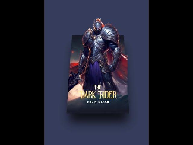
How to Create 3D Card Animation HTML & CSS
A 3D card animation in HTML and CSS is a visual effect that makes use of CSS 3D transforms to create the illusion of a card flipping in 3D space. The animation is triggered by a user interaction, such as hovering over the card with the mouse.
To create a 3D card animation, we start by creating a div element that represents the card. We then create two div children that represent the front and back of the card. The card-face-front div will contain the front of the card, while the card-face-back div will contain the back of the card.
We apply CSS styles to these elements to create the 3D effect. We use the transform-style: preserve-3d; property to enable 3D transforms on the card, and we use the backface-visibility: hidden; property to ensure that the back of the card is not visible until it is flipped.
To trigger the flip animation, we use the :hover pseudo-class in CSS. When the user hovers over the card, we apply the transform: rotateY(180deg); property to the card element, causing it to flip 180 degrees around the Y-axis.
We can customize the appearance of the card by changing the size, color, and content of the front and back elements. We can also add additional CSS styles to modify the appearance of the card, such as adding a shadow or changing the colors.
Overall, a 3D card animation is a fun and visually interesting way to display content on a website or web application, and can add an extra level of engagement to user interactions.
#3danimation #3dcards #html #css
Github Source: - https://github.com/rahul8864/3D_Card_Animation_HTML_CSS
Тэги:
#rahulkumarrj #css #css3 #html #html5 #java #javascript #bootstrap #RahulKumarRJ #rahul_kumar_rj #rahulkumar_rj #rahul_kumarrj #rahulkumarRJ #RAHULKUMARRJ #RAHULKUMARrj #RJRAHULKUMAR #rahulKUMARRJ #rahul #kumar #RJ #rj #rahulkumar #kumarrahulrj #rjkumarrahulКомментарии:
How to Create 3D Card Animation HTML & CSS
TechScript Mastery
2021 сыл. И.Е. Винокуров аатынан Хатыҥ Арыы ОО, Нам улууһа. “Чаҕылыс” бөлөх
Көтүөххэ үрдүккэ хотойдуу уоланнар ааҕыылара
The Padel Club Blueprint: Success Strategies for Aspiring Owners
Padel Smash Academy
Когда утром открываю глаза | Лучший Друг | Христианское караоке
SkyStudio - християнські караоке
Darkorbit - General ⭐
Desti
garib boy ki chori #nemishorts #shorts
Nemi Shorts


