Logo Design Process with a Client – Building A Brand, Ep 6
Комментарии:

Please let me know when you have officially got a proper name picked for a 1 letter monogram. I mean... 'mono' sounds pretty good, right? It's "one" thing. But I think it's putting the full name (first, middle, last) together into "one thing" - / as far as I can tell. Is a single letter a "mono abbreviation" haha!! This is cracking me up. Thank you.
Ответить
I feel you guys pain, the emotional attachment clients have can keep them moving forward. The house H is better than the weird shrub tree. I think little voices made the clients change their minds. Fair enough they want meaning in their logo but at the end of the day customers don't go that deep when buying beer. They can explain the family angle through the messaging of their advertising and their place of business. The tree is odd people might think they're selling trees, the archway makes sense too link it to the building.
Ответить
Sky blue
Ответить
Emmanuel opens his sketchbook
Me: 👁👄👁

Check out a book called Mastering Layout: On the Art of Eye Appeal by Mike Stevens
Ответить
Rule number 1: just as any person, clients feel more confortable to speak about negative things on the internet. Always make sure to comunicate on e-mail too, because it's really impossible to know by person if the cliente truly liked it or if it's just they being polite. Also be prepeared, some o them can ben nice in person and an bully troll on e-mails.
Ответить
Emmanuel's got some skills...
Ответить
This literally sounds like "How its Made" at times!!! hahaa
Ответить
i was in aircraft design before and i relate to this problem on my first project. the realization was humbling and it felt like i was doing the work too much for my own vision, not the client's. now i see why many big companies' rebranding barely changed anything in their new logo like dropbox. at the end of the spectrum you have the meme of oversimplified logo, but it is still their old identity in it, hoping to catch up with responsive designs or whatnot trends by successful competitors. it's been 6 episodes in and i am truly thankful for the amount of exposure you guys willing to share, i learned a lot.
Ответить
Emanuel is killin it, I am going to steal one of his "h"s for my monogram, sorry bro, can't trust NOBODY.................
Ответить
Emmanuel's sketches are amazing 😍
Ответить
Engrossed in this series!
Ответить
Phenom work! Client also had a point regarding his mark’s equity.
Ответить
outstanding production. Thanks for the pointers and explanations of the process.
Ответить
What would be the chances for the final logo to get rejected during registration ? In my country, if people in the registration bureau think that yours looks similar - even a little similar - to another logo that was registered, they will reject yours.
Ответить
I've never heard a designer use the word cool so much to defend a design decision...
Ответить
the sloped H looks like a Z and once I noticed it I had trouble seeing the H again
Ответить
me doing the whole thing alone ;p
Ответить
I need to start my own Logo for "Tederash SACCOS" so advise me how to start from initial
Ответить
O my God
Ответить
I loved the bridge one and felt that it spoke to their previous logo in that the typography had that same squeezed/bow-tie centre. I get that it didn't look as friendly and maybe some of the corners of the letters could have been rounded ever so slightly, but with that I think it would have been awesome.
Ответить
My high school art teacher had us make monogram of our initials.
Ответить
good
Ответить
Any one from Bangladesh? 🇧🇩
Ответить
why have 3 ppl doing same job?
Ответить
AMAZING.......I AM FROM BANGLADESH. I SHOW ONLY A VEDIO . BUT REALLY I IMPRESSED . I LOVE IT
Ответить
I'd really like to know what the budget was for this project, thinking well over $200K
Ответить
why does the design I'm working on show that it's a single stroke and then when I expand it, it changes to an outline ? How do I change it back to a single stroke so that I can use it on ezcad3 ?
Ответить
Thank 💯💯💯🔥
Ответить
Wow, I just stumbled upon this channel and it's so interesting comparing the process of a firm like you guys versus some of the quicker videos of others like Will Patterson.
Ответить
This looks so fun 😮
Ответить
This was amazing. Thank you for sharing.
Ответить
Great video but $250k being spent is crazy albeit appreciate possibly not by this client.
Ответить
This show should be on TV
Ответить
Man, I think we are probably months away from having midjourney making great logos out of the box. Right now, their lettering doesn't work at all
Ответить
how do you deal with revisions with the client if the don't like the logo at all?
Ответить
@@@
Ответить
it felt that when he looked at the logos , being a familly bussiness , withlocally americana heritage, he was expectinc a barn-ish look ( drink some beer and make some love teddy couple)
Ответить
This is inspiring. As designer who has been working in the field for almost 6 years now this really helps in understanding client's needs and how to approach them when they are in need of something new and relatively something they're attached to. Great Video 🙌🏽
Ответить
these designs would have been derivative in 2012.
Ответить
Clients should watch these to show how much work goes into brand work.
Ответить
They are soo good they make me want to quit and start farming
Ответить
using way to much time on this haha... Nike's logo was made of a student. And intern or something like that. Don't make it complicated
Ответить
Maybe transforming the letter "H" into a symbol made of two trees could have been a nice touch. One tree’s branch could extend toward the other, forming the letter H. A simple yet deeply rooted design.
Ответить
Watching a team be so receptive to each others feedback just made me feel SOOO GOOD! Thanks guys for sharing this!!!
Ответить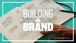




![ALL CURSED DANDY TIKTOK Animations That had Me CRYING REACTION [Dandy's World] ALL CURSED DANDY TIKTOK Animations That had Me CRYING REACTION [Dandy's World]](https://smotrel.cc/img/upload/VXYxdUkwalZjWnA.jpg)
