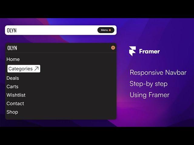
How to Create a Modern Responsive Navbar/Menu Using Framer | Step-by-Step Tutorial
In this video, I’ll guide you through creating a modern, responsive navbar (or menu) using Framer, perfect for web and mobile applications. Whether you're a beginner or an experienced designer, this tutorial will help you master creating a flexible, mobile-friendly navigation bar in Framer. 💻
💖 Support Us on Buy Me a Coffee: https://buymeacoffee.com/mohammadimran/e/322649
🔗 Remix link: https://framer.com/projects/new?duplicate=VZhZjYxsttkYjBbY8wJV&via=khan-mohammad-imran
🔗 Create Framer Account: https://cycloto.com/free-account
💡 Special Promo code: partner25proyearly
You’ll learn:
How to set up a responsive navbar with simple, clean design principles.
Tips on making your menu adapt seamlessly across devices.
How to add interactivity and animation for an enhanced user experience.
Follow Us on Social Media:
X (formerly Twitter): https://x.com/cyclotoco
Instagram: https://www.instagram.com/cyclotoofficial/
Facebook: https://www.facebook.com/cyclotoofficial
Visit Our Website:
https://cycloto.com/
👇 Need help or interested in hiring us for your next project?
Contact Us: [email protected] 📩
If you found this video helpful, don’t forget to like, share, and subscribe for more web design and Framer tutorials!
Тэги:
#framer #framer_tutorial #responsive_navbar #cycloto #responsive_menu #web_design_tutorial #modern_navbar #framer_design #framer_animation #learn_framer #framer_tutorial_for_beginners #responsive_website_design #responsive_navbar_design #responsive_menu_design #responsive_menu_design_using_framer #create_responsive_menu_using_framer #framer_navbar #how_to_create_a_responsive_menu_in_framer #framer_tutorial_for_responsive_navigation #modern_navbar_with_framerКомментарии:
Как сказать по-польски МОЛОДЕЦ?
Polski z Maćkiem / Польский язык с Мачеем
Невозможно строить нормальные отношения, не решив эти вопросы! Деньги в отношениях
Психолог Александр Шахов
The ULTIMATE Future Bass Sample Pack
Musicore
Opening .CSV Files with Excel - Quick Tip on Delimited Text Files
Flexible Assembly Systems Inc
Первые технологии и сбор ресурсов - Pacific Drive #02
Антоха Галактический
USACE - Environmental Stewards
CORPSCONNECTION


