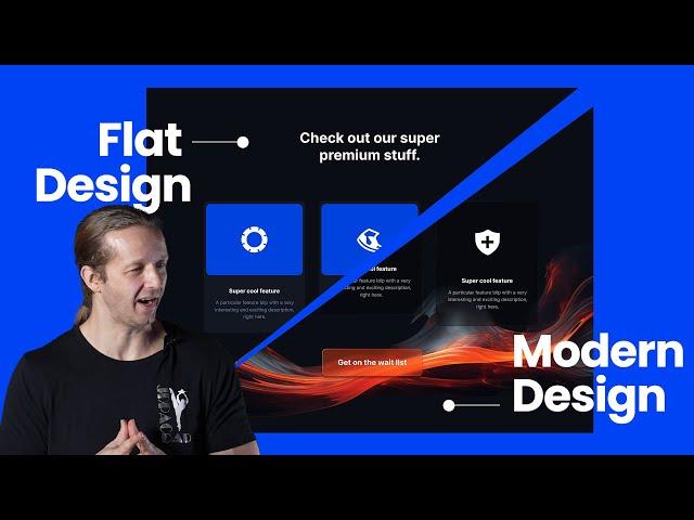
Flat Design vs Modern Design Trends for UI
Комментарии:

superb
Ответить
Hmmm..
Ответить
Designers are the ONLY ones who think this looks good or matters. This is bad for UX and conversions. People just want easy-to-use websites.
Ответить
did you say adobe figma
Ответить
RIP to accessibility.
Ответить
You can fight me but to me it’s easier to make that in css than figma
Ответить
Where can I obtain such stroke effects he used for my projects?
Ответить
I'm a little bit conserned about the accessiblity. I dont think that the contrast of the font to the background is high enough. To think about these little things can help a lot of people. Not just these with bad vision, but also people who uses there device in bright light. I think the design looks good overall.
Ответить
I wouldnt call flat design or stylized graphics as either modern or outdated. This is entirely up to the graphical profile of said company, organisation or individual and you can make either look modern or outdated. Its great these more stylized styles are in fashion but they are still not something that is applicable on much.
Ответить
Thank you for your time, man. You've made a shot, but it's not the way. A lot of effects with no result. First option will work better because as a user I completely understand what should I do on this screen, but on your new screen I can't even find a button on this vivid background. Sorry bro, but design is not just an image ))
Ответить
I enjoy watching the video , would you plz do the transition design video for economic business website ?
Ответить
Adobe figma💀
Ответить
My man Gary looking jacked now. Hell yeah brother.
Ответить
WHAT A MASTER YOU ARE.
Ответить
is still flat design 😂
Ответить
Looks fresh as Windows Vista
Ответить
How can we make a gradient stroke on an element with glasmorphism and transparent background with CSS? A general trick I use is to have a background linear gradient but in this case we want it to have a backdrop filter blur with transparency.
Ответить
finally its time to end the flat lack of creativity!
Ответить
Great content 🏆
Background is wildly distracting though.

This doesn't work in real client work, you can't apply this type of design on every project. Most of the time we follow a brand guideline. If everyone starts doing this type of design on websites, then none of them will stands out, no personnality, just a copy of a trend. Create a brand, unique design, stop following thoses trends, they are only good for portfolios.
Ответить
Dear customer: "Do you want, a bug free, tested, scaling, high availability product that runs on multiple devices and looks homogeneous, or do you rather prefer a design taylored to one screen size with pure focus on fancy effects?"
Don't get me wrong, I like the creativity and sure, it looks more vital & lively
But please don't call this "design trend".
- Contrast between text & background will get poor in some screen resolutions
- Different drop shadows for each element clearly don't scale and will look bad once they are aligned vertically on mobile
- Focus shifts from content to design

At some point I was expecting him to say "just some happy little accidents"
Ответить
Windows 7 UI was way ahead of its time
Ответить
I would call it neo frutiger... miss the transparent elements in UI over there
Ответить
Adobe figma??
Ответить
Don't believe the hype. ;-)
Ответить
This is contradictory. Flat Design already is modern
Ответить
It came out really great. Thankyou for this video
Ответить
Honestly for me.. flat style sucks, it feels without soul, older styles feels better, they have their own magic and look so good
Ответить
but its still 2D, am thinking of something more like 2.5D
Ответить
boring design leads to boring lives
Ответить
I love your videos but didn't watch since 3 years ago. Why the long hair suddenly
Ответить
Thank you so much for this video. Super helpful and well-presented. Your time and effort is most appreciated!
Ответить
Is this a joke? Reminds me of a Microsoft Visa Beta from 20 years ago.
Ответить
Keep up the good work Mate !!
Ответить
You took a perfectly functional design turned it into a over the top monstrosity. You made the CTA button less visible (why?), the cards that were meant to separate the content inside it from the background are now blending into the background and now you have a horribile illustrations on the background drawing all the attention that wasn't supposed to go there...
Ответить
What is flak design? 🤣
Ответить
I'm someone who misses Windows Vista and 7 so much even though I cannot use that OS anymore due to extreme security risks. I missed the old days of glossy/gradient-looking user interfaces as the two OSes speak my design language. Same goes for the earlier Mac OS X versions such as Leopard and Snow Leopard. I get the impression that all the Linux desktop environments and even themes have all fallen victim to flat UI design but then I know some people enjoy a flat UI design. Can't please everyone, can we? I mean, I have a very strong disagreement with big tech's design language, be it from Apple, Google, or Microsoft. So, in KDE, the Oxygen theme is the only one left...
Ответить
The problem is that everything is so fast paced now, that there is no money in moving away from flat design, and it’s not just on our screens, everything is being simplified and made boring, because of the same fast paced lifestyle, if we don’t want to live in a conveyor belt on size fits all would, we need to break away from lazy convenience and move back to a purpose filled lifestyle, we have sucked the soul out of everything, and it’s noticeable in the way people behave now, and how mentally sick we have all become. If we don’t break free from this trend, we’ll all just sit in some pod isolated from our surroundings and living in a Matrix kind of lifestyle. Where no one really can be free. Life is more than convenience, it’s about exploring and discovering new and exciting things that can broaden our horizon and minds.
Ответить
One is not better than the other. They just convey different messages
Ответить
Caught myself nodding my head at points through this video. Modern UI has become so "Clean", it's sterile and devoid of life. Cool stuff :)
Ответить
Now show us how to do the gradient stroke in css.
Ответить
How can we make our sites look more gay?
Ответить
this aint it
Ответить
Your video connected with me. I am a C++ dev, but recently have the need to learn a bit of web design for a few sites. It appears Figma is a wireframing tool, but doesnt spit out code. However, I can use it to witeframe things before I make them into HTML and CSS, right? Does this help me figure out the styles directly? For example, it gives me the CSS for the boxes with stroke and fill values, as long as it's SVG right? A little unsure if I should learn Figma or just jump into VSCode directly for doing a handful of pages.
Ответить
This video is simply too long for what it is.
Ответить
Damn, this was completely useless
Ответить
should have titled this video, "How to make enemies with your frontend developer" ☠️
Ответить


