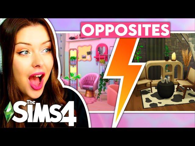
Building OPPOSITE AESTHETIC Townhouses in The Sims 4 // Sims 4 Build Challenge
Комментарии:

I definitely see the two sims being friends, especially with how similar a lot of their furniture is, just in different swatches! My headcanon is that they go furniture shopping together a lot, just getting items in different shades. Also, them having very different styles but having similar furniture can be a metaphor for how they don't seem similar on the surface, but still have a lot in common deep down.
Also, I love both of these townhouses so much! I'd love to live in either one, I genuinely think I prefer the neutral one though

it’s giving wednesday and enid vibes
Ответить
The every day clutter kit is my favorite
Ответить
More and more items are added soon.
Ответить
here are the people i think would live there!
on the pastel side, we have a tidy introvert who loves art and funky things no one would buy. they probably make sure their side is very clean/quaint and they seem to be very quiet, rarely to be heard from the other side of the building.. i would say they spend a lot of time painting, chilling out, playing video games, diy-ing and all sorts like that! they are (in my mind) a humble, homie, good spirited geek who stays at home but when they go out are the funny one who lifts the mood! also at home they are pretty conservative and fun at the same time, making sure not to bother the neighbours. on that topic, only inviting the best of friends round not to bother the friendly folk next door.
on the neutral side, we have an outgoing, seemingly perfect, quaint extravert who is the biggest plant mom of the century. they love everything to match and are a big perfectionist, but also like things to feel lived in and functional. they love neutral tones of course, and they love the grand tones u find in nature. earthy, fresh feeling colours are their favourite way to express their way through their home, although they don’t spend as much time in it. they love to cook, have friends over, go out, work, doodle and sketch. they are very impatient and times but do care about others and spend so much time in local nature.

this is literally that pastel and black house in San Francisco meme hahah it's so cute!
Ответить
This is so Wednesday and Enid sharing a university dormitory, LUV IT!
Ответить
I would hate a window that big in the bathroom facing the road
Ответить
the opposite aesthetics remind me of wednesday and enid lol
Ответить
How can I download these items?🥺 I'm a noob
Ответить
Not to be that person but it kinda reminds me of Enid and Wednesday not fully but it's just something i think they would like(I really bad at explaining so hopefully this made sense 😅)
Ответить
Why u always forgot curtains on bedrooms?
Ответить
The bathroom kit prediction aged like fine wine 😌
Ответить
Omg the fact she was spot on abt the bathroom kit lmao
Ответить
bathroom clutter did come next lol
Ответить
I am watching this 2 months later and yes, we now have bathroom kit. Good guess!
Ответить
U are sooo underrated! I just found ur account today and i am in love! Ur builds are stunning
Ответить
The strawberry wallpaper would be so cute for a country homes kitchen. Henford on Bagley. Omg please do a farm build. 😍😍😍
Ответить
Look @ you predicting the future with the bathroom kit comment. LOL😝
Ответить
To be honest the pastel side looks more of a retro style, because of all the pink and blue, bright colors and lights
Ответить
Anyone else think this could be a opposite’s attract love story or just me?
Also love is build! ♥️ ♥️

Pls make Sims for it 2 bestie going to art school 🏫 ❤
Ответить
pastel kit and high school kit are bestt
Ответить
I LOVE EDITING SYD SO MUCH. LOVE HER. PROTECT HER AT ALL COST. U GO QUEEN 🩷🩷🩷🩷🩷🩷
Ответить
The desk from the pastel pop kits makes me think about the Winx! It would be a good idea to do like Winx club dorms !
Ответить
Wednesday and enid! ♥︎
Ответить
Look at you predicting the bathroom pack before it came out
Ответить
You predicted the bathroom kit 😭
Ответить
syd predicted the bathroom clutter kit
Ответить
love it :]
Ответить
to be completely honest, the industrial and neutral side reminds me of a brewery/restaurant in my area😂❤
Ответить
did she purposely make the other apartment smaller? orrrrr am i missing somethinggg?
Ответить
If you do another building the opposite aesthetic challenge could you do retro and modern?
Ответить
they are giving enemies to lovers
Ответить
This feels like Wednesday & Enid's townhouse 🤣
Ответить
idk why but one side is bigger than the other lolll
Ответить
they're gfs your honor
Ответить
You predicted the Barbenheimer through this
Ответить
this was my Barbenheimer
Ответить
The only thing that crosses my mind is next door neighbor Enemies to Lovers trope hahaha
Ответить
Tje pastel house is mega cute but that bed color is (im sorry ) meh
Ответить
Man, I'm watching this video after the minimalist vs maximalist one, and I think I just got very clear confirmation that that colour is NOT my thing. In this one, the pastel house was making me so uncomfortable. Thinking about walking into a house like that was giving me anxiety. 😂
Ответить
It's giving Angela and Lillith Pleasant.
Ответить
Is this build on the gallery?
Ответить
Ok so I don’t have any packs or anything and I don’t know what ones to buy, what are some of your favorites?
Ответить
I love to fall asleep to your build videos! It helps with my anxiety!
Ответить
Sorry 🍁
Ответить
are you team pastel?🌸 or team neutrals?🖤
edit: I wasn’t clear in the vid but plumbella helped make the pastel kit not the clutter kit***




![GO8 | Soch Le [@mokshamusix ,@rohitthevenom ] HATRED GO8 | Soch Le [@mokshamusix ,@rohitthevenom ] HATRED](https://smotrel.cc/img/upload/d3kyMkhUMzc2eTY.jpg)


