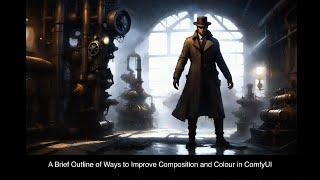
A Brief Outline of Ways to Improve Composition and Colour in ComfyUI
Комментарии:

Im really liking your videoes! Thank you for taking the time to make them 😊
Ответить
Someone's view need to be trained to get an visual, conceptional impression like photographers or painters have, thinking about e.g. composition, harmony, rule of third, fibonacci. Most users are not getting "educated" using only AI, because these users aren't familiar with all the concepts you mentioned. They are not getting corrected by AI and image evaluations or discussions are not going to happen. There are already some positional helper tools available in ComfyUI, but a lot of users are already struggeling with prompt issues. Everybody is happy if the main idea got produced by AI. Next issues are correcting imperfections and lastly upscaling. Unfortunately composition seems to be the very last topic, most users are thinking about. I've seen portfolios where users have produced dozens of rows or more of female portrait images all looking the same regarding composition. Nevertheless, thanks for your work, Rob. I always appreciate it to listen to your ideas and concepts. Keep up the good work!
Ответить
I like this kind of discussion and your videos where you show establishing lighting and composition using noise gradients. I've done a lot of photography and have a good sense of composing using cropping and camera height, but I just make do with what lighting there is.
Working with SD has actually made me more aware of this by what it does automatically. Especially if you say the person is small in a large scene it will use lighting and line to draw attention to the subject, and this can even be a bit too much. And, well there does have to be light for you to see anything. By default SD may tend to be indecisive, but it does create highlights and shadows, and also use sharpness and detail to lead the eye.
Do you have any ways of guiding the sharpness/detail in comfy? I guess you could use masks. I noticed in a video on using face detailers is that a way you can go wrong is by sharpening a peripheral face up too much. This gives a very pasted look.

Amazing video as usual. Thanks a lot!
Ответить
i like your video!
Ответить
Great video, would love to see more like this. Thanks!
Ответить


